
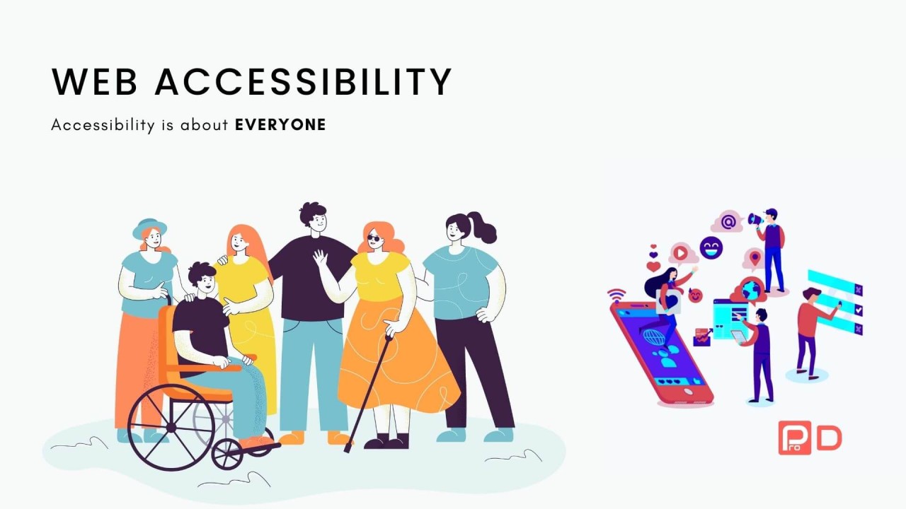
In today’s digital-first world, your website is often the front door to your business, service, or brand. But if your site isn’t accessible, you’re unintentionally locking out millions of users. Web Accessibility Best Practices means making sure everyone—regardless of ability—can access, navigate, and engage with your content.
Why Accessibility Matters,Web Accessibility Best Practices
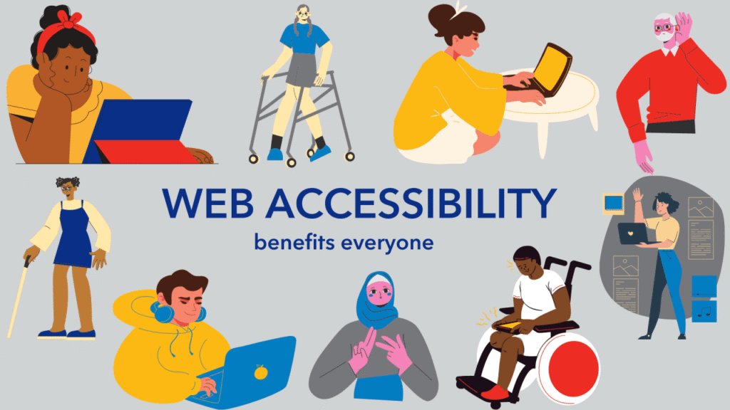
According to the World Health Organization, over 1 billion people—about 16% of the global population—live with some form of disability. This includes visual, auditory, motor, and cognitive impairments. By making your website accessible:
- You reach a broader audience.
- You enhance user experience for everyone.
- You meet legal and ethical standards (e.g., ADA, WCAG).
- You boost SEO and site performance.
Principles of Accessible Design
To start designing inclusively, follow the WCAG (Web Content Accessibility Guidelines) principles: POUR.
- Perceivable
Content must be presented in ways users can perceive:- Use high color contrast.
- Provide alt text for images.
- Ensure text is readable and resizable.
- Operable
Users must be able to interact with the interface:- Make all functionality available via keyboard.
- Provide clear focus indicators.
- Avoid content that causes seizures (e.g., flashing).
- Understandable
Information and navigation must be easy to comprehend:- Use clear, concise language.
- Create predictable navigation and layout.
- Provide instructions and error messages where needed.
- Robust
Content must work across a range of devices and technologies:- Use semantic HTML.
- Test compatibility with screen readers.
- Keep code clean and standard-compliant.
Practical Steps to Improve Accessibility,Web Accessibility Best Practices
- Use semantic HTML: Elements like
<header>,<nav>,<main>, and<footer>provide structure for screen readers. - Add ARIA labels when needed: They give extra context to assistive technologies.
- Design with contrast in mind: Tools like the WebAIM contrast checker can help ensure readability.
- Include keyboard navigation: Users should be able to tab through your site logically.
- Test with screen readers: Try NVDA (Windows) or VoiceOver (Mac) to see how your site sounds.
- Caption all videos and transcribe audio: This benefits not just deaf users but also those in quiet or noisy environments.
- Build accessible forms: Use labels and error messages clearly tied to each field.
Common Accessibility Mistakes to Avoid
- Using color alone to convey meaning.
- Missing alternative text for images.
- Poor heading structure (e.g., skipping from
<h1>to<h4>). - Over-reliance on JavaScript for crucial features.
- Lack of focus indicators when navigating with the keyboard.
Tools to Help
- WAVE – Accessibility evaluation tool.
- axe DevTools – Browser extension for automated testing.
- Lighthouse – Chrome’s built-in performance and accessibility audit.
- Color Oracle – Simulates color blindness for designers.
Conclusion
Designing for accessibility isn’t just a checkbox—it’s a mindset. It ensures your content is usable by everyone, including people with disabilities, older adults, and users in challenging environments. Accessibility enhances your brand’s reputation, improves SEO, and most importantly, reflects a commitment to inclusion and empathy.
So next time you work on your website, ask: Can everyone use this? If the answer is no, it’s time to design for accessibility.